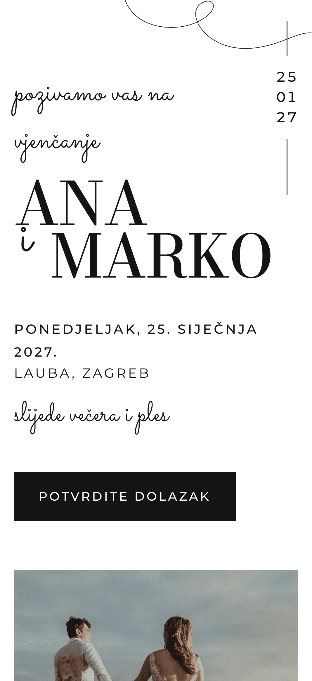
Tinta
A classic white invitation.
Designs with little decoration, clear type and plenty of white space. They suit smaller receptions and weddings without much ceremony.
A classic white invitation.
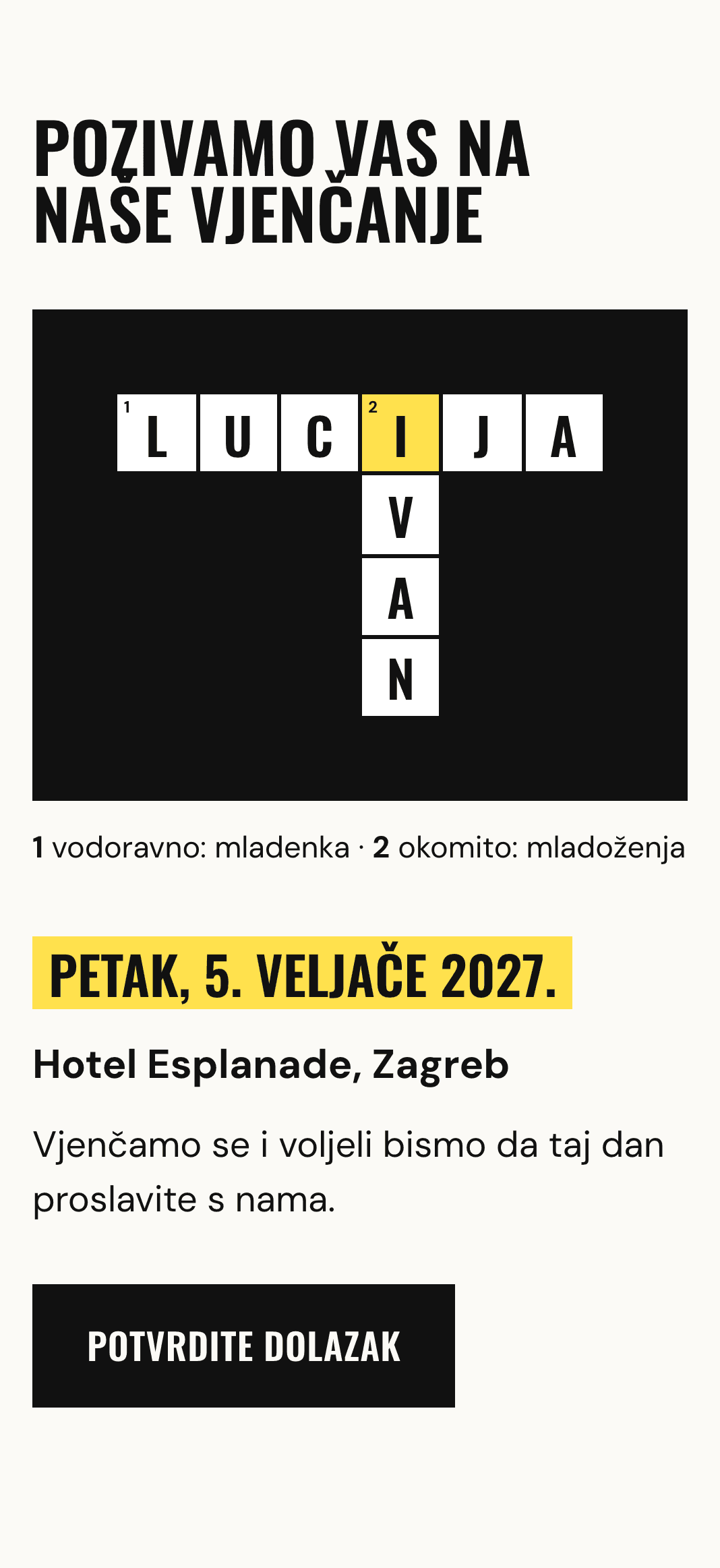
Your names in a crossword.
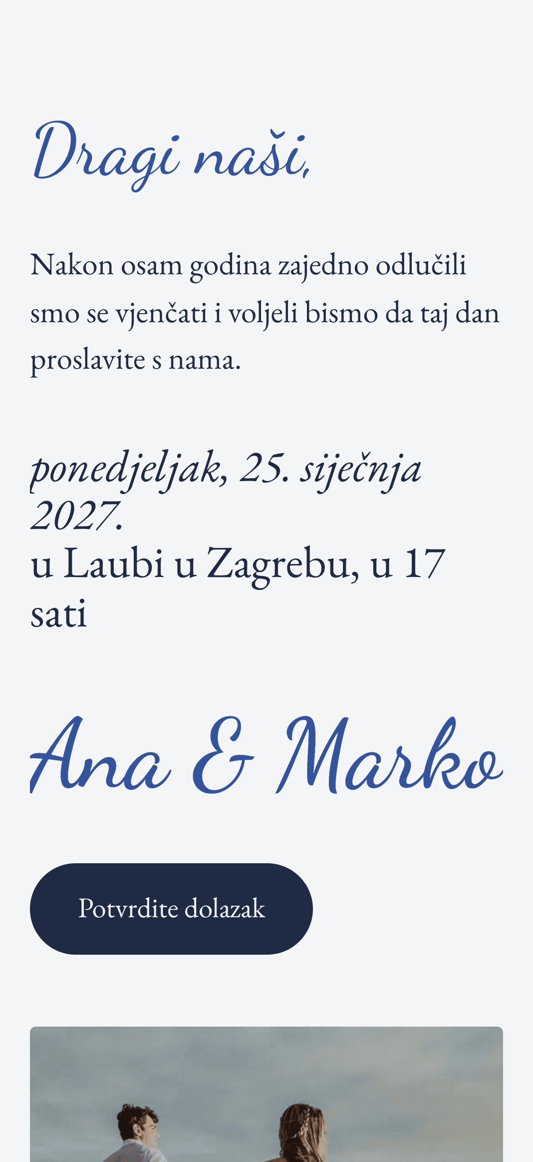
A letter from the two of you.
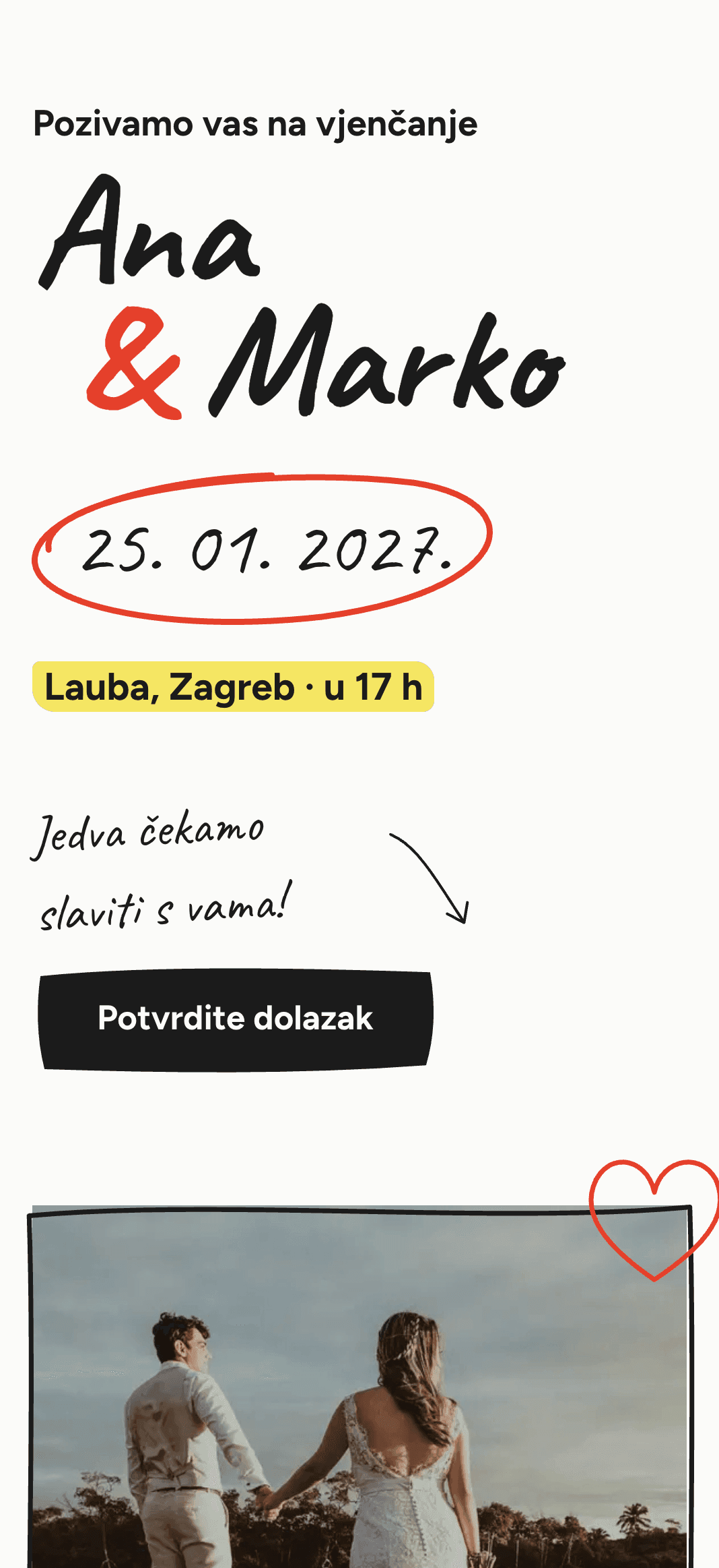
Written by hand with a marker.
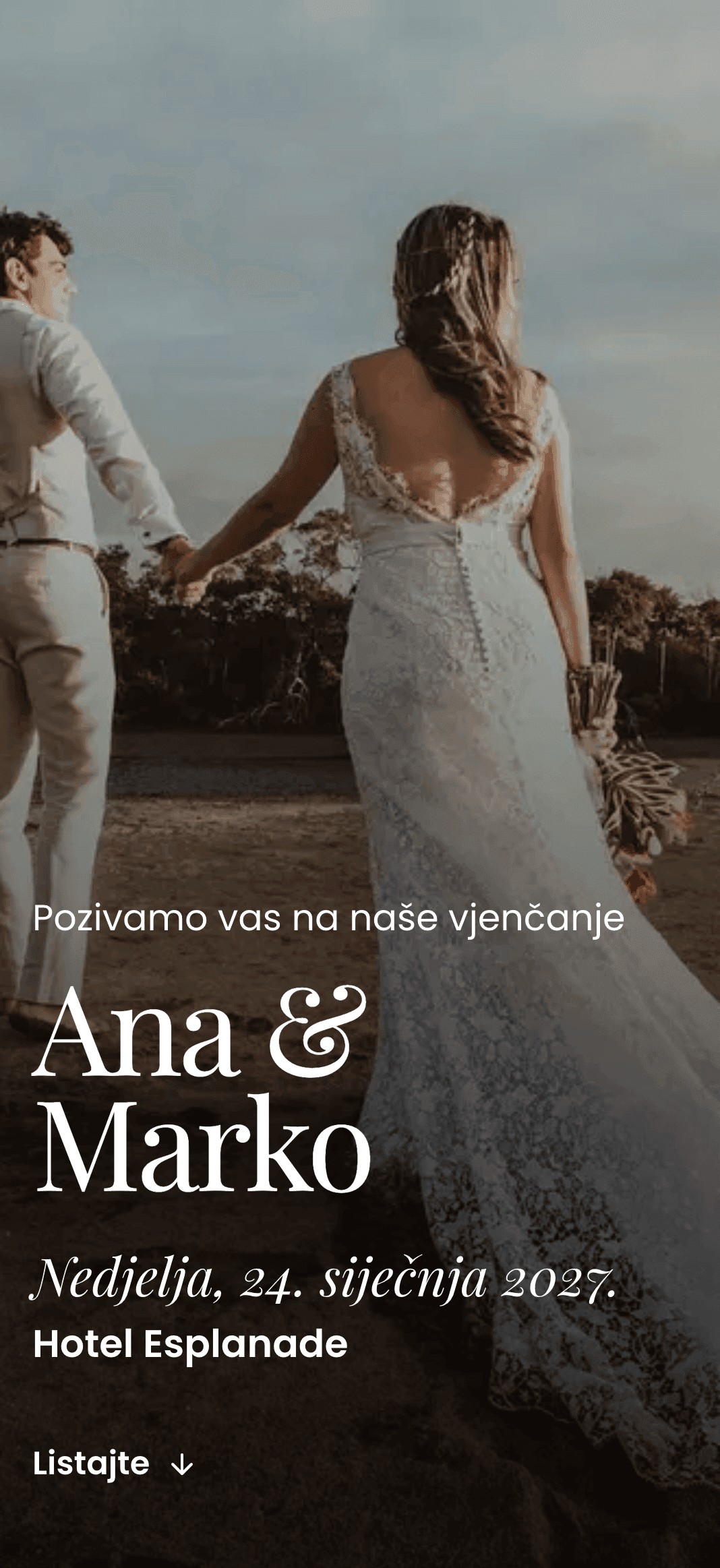
A large photo and big names.
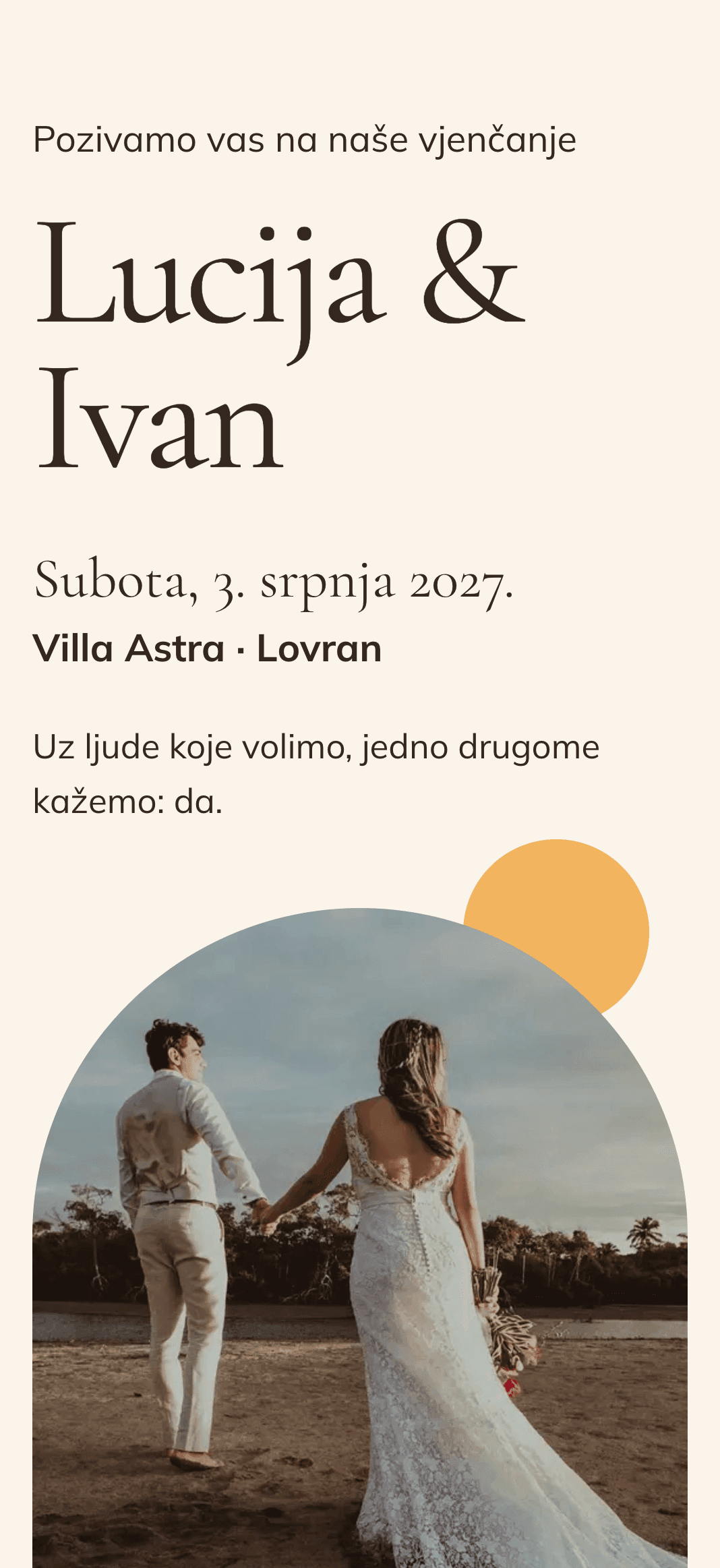
Two gold rings and an arch.
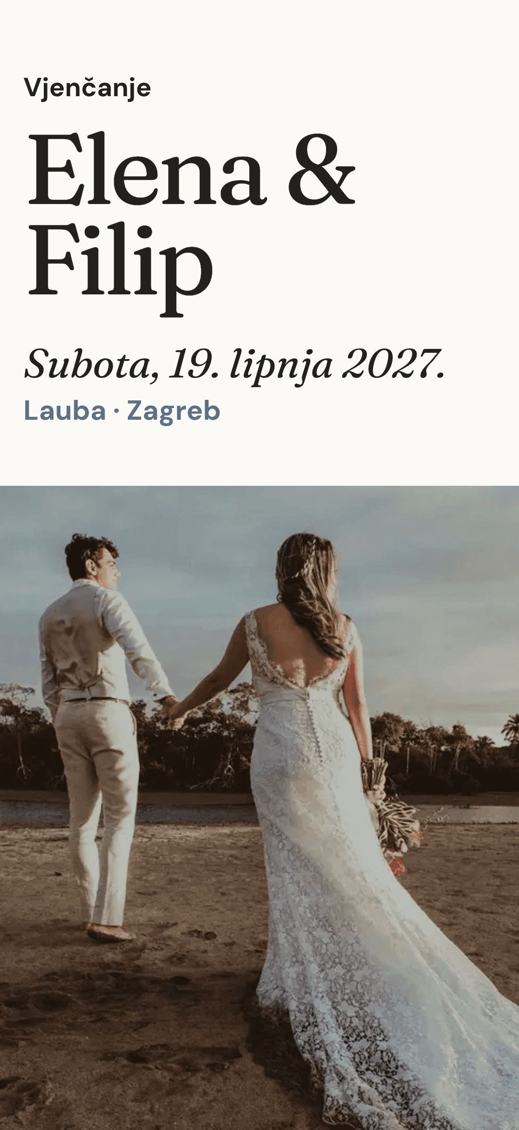
A white veil and big photos.
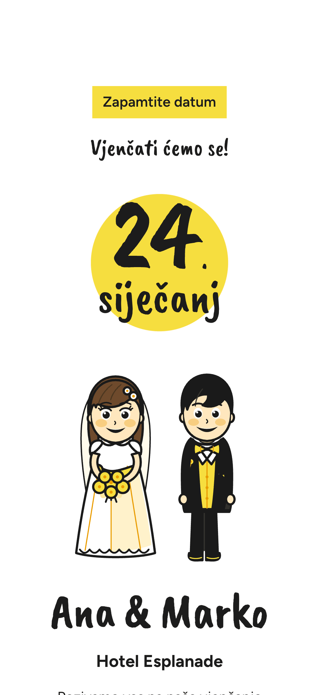
A drawn couple and lots of yellow.
A minimalist invitation puts the date, the place and the RSVP first. These designs are also the easiest to make your own, because changing two colours and the font shows straight away.
The liveliest are Venezia, a yellow card with a drawn couple, and Flomaster, which looks handwritten. The rest are black and white or a few quiet tones.
Just black type and white paper, nothing else.
Your names in a newspaper crossword, black and white with a yellow highlighter.
Almost all text, written as a letter to your guests. Good if you like writing and have something to say.
It looks as if you wrote it yourself in marker, with the date circled in red.
Almost no decoration: one photo, big names and a lot of white.
Light and soft, with one photo in an arch.
Lots of white space and one quiet colour, grey-blue, so nothing pulls attention from your photos.
A yellow card with a drawn couple waving, and the text set on a typewriter.
Tinta, Križaljka and Venezia look finished without photos. Milano and Siena are built around photos, so you need a few good ones for those.
Tinta, Križaljka and Venezia look finished without photos. Milano and Siena are built around photos, so you need a few good ones for those.
Yes. You can hide or move any section, such as your story or the gallery, so only what you want stays on the invitation.
Yes. Pick a song that plays while guests scroll, or leave the invitation without music.